
Frequency Polygon
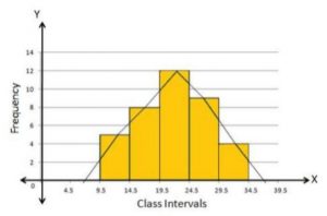
A frequency polygon is a line graph representation of class frequency plotted against the midpoint of the class frequency. It is identical to the histogram but there is a difference in it is a line joining the midpoint of the class frequency and forming a curve. Joining the midpoints of the rectangle gives a frequency polygon. In statistics the data is shown using some shapes and symbols in a graphical form, a frequency polygon is one of them. The diagram of the frequency polygon is mentioned here for your better understanding. So observe the below figure.
What is a frequency polygon?
A frequency polygon is a polygon produced by joining a line segment of the midpoint of the top rectangles in a histogram curve. It is produced by making a histogram. A frequency polygon is a graphical representation of the data that can be obtained by joining the midpoint of the top of the rectangle in a histogram. It’s a pictorial representation of the data used for the analysis of huge data for any particular purpose.
Frequency Polygon Graph
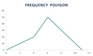
A frequency polygon is a pictorial representation of data using a line joining the center of the top of rectangles in a histogram. It is formed on the x-axis and the y-axis shows the number of repetitions of each category. While plotting a frequency polygon graph, you should mark the mid-point correctly which is called the class interval. It can be drawn after making a histogram easily or can be drawn also without a histogram. For drawing of frequency polygon using a histogram, we first draw rectangular bars against the class intervals and join the midpoints of the bars to get the frequency polygons. To draw a frequency polygon some steps need to be followed as listed below.
- To draw frequency polygons, firstly we need to draw a histogram.
- Then choose the class interval and mark the values on the horizontal axes on the graph
- Mark the mid value of each interval represented by rectangles on the horizontal axes.
- Mark the frequency of the class on the vertical axes in a graph
- Corresponding to the frequency of each class interval, mark a midpoint of the class interval
- Join all these points using the line segment.
- The resultant representation is a frequency polygon for given data.
A frequency polygon graph is shown below.
Frequency Polygon in Statistics
In statistics, a graph or figures are used to represent data. A frequency polygon is a graphical representation of the data joining the midpoint of the top of rectangular bars in each interval or bin.
Frequency Polygon Example
The solved example of a frequency polygon is shown below for a better understanding of students.
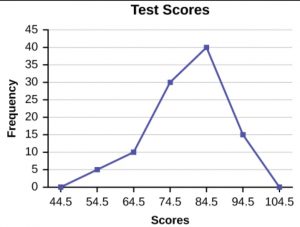
Example: Construct a frequency polygon using the data given below:
| Test Scores | Frequency |
| 49.5-59.5 | 5 |
| 59.5-69.5 | 10 |
| 69.5-79.5 | 30 |
| 79.5-89.5 | 40 |
| 89.5-99.5 | 15 |
Solution: Firstly, we first need to calculate the cumulated frequency from the frequency given.
| Test Scores | Frequency | Cumulative Frequency |
| 49.5-59.5 | 5 | 5 |
| 59.5-69.5 | 10 | 15 |
| 69.5-79.5 | 30 | 45 |
| 79.5-89.5 | 40 | 85 |
| 89.5-99.5 | 15 | 100 |
Now we start by plotting the class marks such as 54.5, 64.5, 74.5, and so on to 94.5. Note that we will also plot the previous and next class marks to start and end the polygon, i.e. we plot 44.5 and 104.5 as well.
Then, the frequencies corresponding to the class marks are plotted against each class mark. As you can see in the figure below, this makes sense as the frequency for class marks 44.5 and 104.5 are zero and touch the x-axis. These marked points are used only to give a closed shape to the polygon. Then the frequency polygon looks like this:
Frequency Polygon and Histogram
A frequency polygon is a graphical representation of data using lines to join the midpoints of each interval, or bin while A histogram is a graph that illustrates the relative frequency or probability density of a single variable. The difference between a frequency polygon and a histogram is mentioned below.
- A frequency polygon is a line graph, whereas a histogram is a collection of adjacent rectangles.
- A Frequency polygon is multi-dimensional, whereas a histogram is a two-dimensional figure.
- Several frequency distributions can be plotted on the same axis as a frequency polygon. However, in the case of a histogram, we must have to draw a separate graph for each distribution.
- A frequency polygon is a continuous curve and it is easy to determine the existence and rate of charge estimates. It is not possible in the case of a histogram.
Frequency Polygon: FAQs
Que.1 Define a frequency polygon.
Ans – A frequency polygon is a pictorial depiction of the given data made by joining the midpoints of the top of rectangular bars.
Que.2 Is a frequency polygon and histogram similar?
Ans – No, it’s not similar but has some similarities. The major difference between them is the histogram is a graphical representation of data using adjacent rectangles while a frequency polygon is a curve obtained by joining the midpoint of that rectangles.
![]()
Source link